Update your CMS and LMS design with taste using this AI prompt
Design a CMS or LMS with taste using a complete AI prompt. Apply warm neutrals, clear typography, and considered spacing to your existing interface.

Your CMS or LMS is a place people return to every day. Editors need to find drafts and schedule posts. Instructors need to review submissions. Learners need to see what to study next. Those tasks feel easier to follow when the interface has clear priorities, readable type, and space used with care.
Designing with taste means making those decisions consistently: a restrained palette, a clear primary action, and details that feel like they belong together. The AI prompt in this guide turns that direction into a practical brief for your existing content management system or learning management system. Copy it into your coding tool, identify the screen you want to refresh, and give it a coherent visual system to apply.
What designing with taste looks like
Start with the parts people encounter on every screen: navigation, headings, panels, controls, and records. When those parts share a consistent treatment, a content list and a publishing form can feel connected. The same applies to an instructor’s submission queue and a course overview.
Our Admin Dashboard UI design system supplies the visual reference. Its warm off-white canvas and tinted sidebar frame white panels. Charcoal gives important actions and table headings definition, while restrained colors distinguish statuses and chart series. The preview shows those rules in an analytics screen; the prompt explains how to apply them to your product’s existing content and tasks.
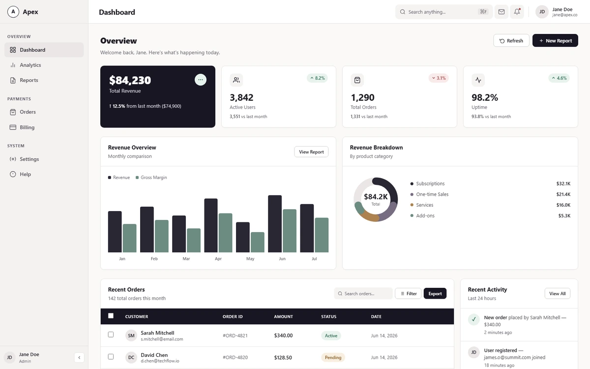
The source design system in an analytics screen. Use its surfaces, typography, and component treatments as the visual reference for your CMS or LMS.
Carry that visual language into your publishing queue, media library, course list, or submissions table. Keep the labels, records, and controls that make each screen useful. Where a screen has no headline metrics, the primary action and table headings can provide the charcoal emphasis.
Copy the design prompt for your CMS or LMS
The snippet below contains the complete brief, including the Admin Dashboard UI colors, spacing, typography, component treatments, and responsive guidelines. It also tells the coding tool to inspect your application and preserve its working behavior. Use the copy button, then add the screen, user role, and main task when you paste it into your project.
Refresh the visual design of my existing admin panel, dashboard, CMS, or LMS using the Admin Dashboard UI design system below. Implement the changes in this project. Aim for a calm, coherent interface with clear hierarchy, readable records, and restrained color.

FIRST, UNDERSTAND THE EXISTING PRODUCT
- Inspect the application, shared layout, design tokens, components, and styling approach before editing. Identify the requested screen and the shared components it uses. If I have not specified a screen, start with the existing dashboard or main overview.
- Keep the current framework, routing, component library, icons, and chart library. Reuse existing components and tokens where possible. Make changes in the existing files rather than building a separate mockup.

PRESERVE THE WORKING APPLICATION
- Preserve section order, navigation labels and destinations, page content, real data, APIs, authentication, role permissions, business logic, and integrations.
- Keep search, filtering, sorting, selection, row actions, forms, validation, dialogs, notifications, and pagination working. Carry through loading, empty, error, disabled, active, hover, and keyboard-focus states.
- Treat the reference layout, metric names, and chart types below as examples from the source design. My existing product structure and tasks take precedence. Apply the visual rules to components that already exist; do not force every screen into four KPIs, two charts, and a revenue table.
- Do not invent financial data, users, courses, progress, charts, subscription tiers, or decorative dashboard widgets. Do not remove useful fields or actions to make a screenshot look cleaner.

ADAPT THE STYLE TO THIS PRODUCT
- In an admin panel, retain operational metrics, records, statuses, and bulk actions. In a CMS, retain content titles, authors, publication states, filters, and publishing controls. In an LMS, retain course information, learner progress, assessments, and role-specific actions. Use the vocabulary already present in the application.
- Where a lead metric exists, use the charcoal treatment for the number most relevant to the current task. If there is no metric card, use charcoal for the primary action and existing table header without adding a new card.
- Standardize repeated spacing, borders, radii, typography, icon tiles, controls, and status badges through shared components or scoped tokens. Keep dense tables useful; make units, timestamps, column alignment, and row actions easy to scan.
- Keep existing chart types and exact values. Apply the reference palette consistently to series, tooltips, and legends. Keep chart labels and visible status text; color must not be the only way to identify a series or state.

RESPONSIVE AND INTERACTION CHECKS
- Preserve working responsive behavior. Use the reference breakpoints as a starting point where this product needs them, adjusting for actual content and navigation.
- If a sidebar collapses or becomes a drawer, keep every destination reachable through a labeled control. Keep essential search, filters, and account actions available on small screens through compact controls rather than simply removing access.
- Keep horizontal table scrolling inside the table panel. Let long titles, translated labels, and real names wrap without causing the whole page to overflow.
- Keep form labels, visible keyboard focus, logical tab order, and readable text on both white and charcoal surfaces. Respect reduced-motion preferences.

FINISH THE IMPLEMENTATION
- Check the result at desktop, tablet, and narrow mobile widths, including 320px. Exercise the existing search, filters, forms, dialogs, row actions, and pagination that the changed screen supports.
- Run the project's relevant checks. Report the files changed, the shared styling decisions, what you verified, and any unfinished integration. Do not claim an interaction was tested unless you exercised it.

Apply the following visual reference within those constraints:

## Admin Dashboard UI Design System

### Visual Direction

Set the dashboard on a warm off-white canvas with a softly tinted sidebar and white data panels. Use solid near-black ink for the primary action, lead KPI, and table column header. Use clean outline icons, compact controls, and clearly separated rows. Reserve stronger color for chart series, statuses, and small highlights.

Apply the theme to the existing dashboard. Keep its section order, grid sizes, navigation, data, controls, and responsive behavior.

### Layout and Spacing

- Keep the 240px grouped sidebar, 64px collapsed rail, and 64px sticky navbar with search, notifications, and profile. An optional 56px workspace switcher rail fits products with distinct top-level modules.
- Start the main content with the page title, subtitle, and actions. Follow with a four-card KPI row, paired chart panels, then the data table and activity list. Keep the table on the wider side.
- Use 28px vertical and 32px horizontal content padding on desktop, 24px between content rows, and 16px grid gaps. Keep card interiors at 20–24px and header padding at 16px by 20px.
- At 1100px and below, use two metric columns and stack the chart and lower panels. At 900px and below, use the compact sidebar and tighter content padding. At 600px and below, hide the sidebar, full search field, and profile text, use 16px content padding and one metric column, and allow horizontal scrolling inside the table.

### Color and Surfaces

- Canvas `#FAF9F8`, sidebar `#F3F1F0`, white card and navbar surfaces `#FFFFFF`.
- Separators and card borders `#E7E3E2` at 1px. Use a 10px card radius and a faint shadow of `0 1px 2px rgba(24,22,34,0.04)`.
- Inset fields and icon tiles `#F5F3F2`, selected or hover fills `#EAE6E5`, quiet table row hover `#F8F6F5`.
- Use ink `#181622` with white text for primary controls and the table header. Use `#302C39` for the primary button hover and `#D8D4DF` for supporting copy on ink.
- On light surfaces use primary text `#201D25`, secondary text `#514D56`, and muted text `#68636D`.
- Use pale mint `#E6F3ED` with deep green `#28584B` on the lead KPI's circular detail button.
- Status pills use soft fills and dark text. Success pairs `#E8F3ED` with `#26644C`, warning `#F8EFE0` with `#865823`, error `#F8EAE9` with `#A43A3D`, and neutral `#EAE6E5` with `#514D56`.

### Typography

- Use Inter with system sans-serif fallback. Keep body text at 14px and metadata at 12–13px.
- Use 22px weight 800 for the page title, 20px weight 700 for the navbar title, and 15–16px weight 700 for card titles.
- Lead KPI values are 30px weight 800. Supporting metrics use 26px weight 700 with slightly tight tracking.
- Sidebar section labels and table column headings use compact uppercase text with modest tracking. Chart axes use 11px weight 500.

### Navigation and Actions

- Keep the existing outline navigation icons and group labels. Use a white, circular outline mark beside the wordmark and a warm inset fill with ink text for the active link. Use neutral fills and ink initials for avatars.
- Place search, filters, and utility icons on inset surfaces. Use muted placeholders and a visible focus ring. Give the primary button an ink fill and secondary actions a white surface with a neutral `#D3CDCB` outline. Keep the existing button sizes and small corner radii.

### Metric Cards

- Give the lead KPI, such as Total Revenue, a solid ink surface with white numerals and light supporting text. Keep the circular detail action in its top-right position and give it the pale mint fill.
- Keep supporting cards white with fine borders, neutral 36px outline icon tiles, and compact green or red trend badges. Keep the value, label, and comparison grouped beneath the icon row. An optional small sparkline can show the same trend.

### Charts

- Keep the grouped bar chart and its hover tooltip. Use `#292633` for Revenue and `#6D8C82` for Gross Margin, with matching legend swatches. Use slightly rounded bar tops, muted axis labels, and an ink tooltip with white text and a small pointer.
- Keep the SVG donut and its center total. Use graphite `#292633`, dusty mauve `#776C82`, muted ochre `#AD824F`, and sage `#6D8C82` for the segments with a warm neutral track `#EAE6E5`. Match each dot to its segment and show the category and amount in the legend.
- Apply these same colors to an optional half-donut or single-series progress ring. Pair each series with its label and preserve exact values in tooltips or adjacent text.

### Table and Activity

- Keep the table title and action bar white. Use a solid ink band for the column headings and keep rows white with fine dividers. Retain the checkbox, avatar, status, row actions, and pagination placements.
- Use the semantic status pairs for the existing badges and color the current page button with ink. Keep secondary row actions in their existing hover treatment.
- Use neutral avatar fills in the activity list and small green, amber, and red tiles for status icons. Keep timestamps muted and the existing row separators.
- Where another dashboard uses ranked lists, quick access tiles, or a hero banner, apply the same white surfaces, soft dividers, and ink focal treatment.

### Completion

Confirm the dashboard retains its content, order, and interaction states at desktop, tablet, and mobile widths. Check that the chart legends still match their series and that text remains readable on both light and ink surfaces.
Apply the prompt to your CMS or LMS
- 1Open your CMS or LMS project in your AI coding tool so it can inspect the existing screens, shared components, and styling.
- 2Copy the prompt above and identify one screen to refresh, such as the CMS content list or the LMS submissions queue.
- 3Describe who uses that screen and what they need to do. Include the important records, states, and actions the design must keep visible.
- 4Review that screen with real content and working controls. Once the treatment holds together, apply the same shared styling to related screens.
For a CMS: Refresh /admin/posts so editors can scan publication states, filter drafts, and publish in bulk. For an LMS: Refresh /instructor/submissions so instructors can find work awaiting feedback and open the grading controls. Keep the existing permissions and workflows.
Five rules for a UI with taste
Build a quiet frame around the work
Use #FAF9F8 for the canvas, #F3F1F0 for the sidebar, and white for the working surfaces. Fine #E7E3E2 borders give a content table or course panel a clear edge. Repeat the source’s 10px card corners and faint shadow across related panels so the page feels composed as a whole.
Give the main action a clear priority
Ink #181622 gives the primary control a strong, consistent treatment. In a CMS, that might be Publish or Schedule. In an instructor view, it might be the action that completes a review. Keep secondary controls quieter, and use the same ink for table headings and any existing lead metric. The emphasis should follow the task on that particular screen.
Use a repeatable type and spacing scale
The reference uses Inter, 14px body text, 12–13px metadata, and 15–16px card titles. That gives content names, course titles, timestamps, and supporting details distinct roles. Desktop spacing starts with 28px vertical and 32px horizontal content padding, 24px between rows, and 16px grid gaps. Adjust those values for the actual screen while keeping repeated components consistent.
Let color explain the state of the work
Use soft badge fills with darker, visible labels for states such as Published, Scheduled, Awaiting review, or Overdue. Keep each state’s treatment consistent wherever it appears. If the screen includes charts, repeat each series color in its legend and retain the values in labels, tooltips, or adjacent text. Warm neutrals elsewhere give those informative colors room to stand out.
Make dense screens comfortable to scan
Content libraries and learner lists often need plenty of detail. Keep titles easy to identify, align comparable dates and numbers, and place row actions consistently. Allow long titles to wrap without crowding neighboring controls. On narrow screens, keep horizontal scrolling inside the table panel and provide reachable compact navigation and filters.
Choose the screen and the person using it
| Screen | The main task | Give emphasis to |
|---|---|---|
| CMS content list | Find drafts, check schedules, and select posts for publishing | Publication states and editorial actions |
| CMS media library | Find assets and inspect their names, types, and details | Readable asset information and selection controls |
| LMS instructor view | Review submissions, find overdue work, and open feedback | Submission states, due dates, and grading actions |
| LMS learner dashboard | Find assigned courses and continue the current lesson | Progress, the next lesson, and upcoming deadlines |
Give the coding tool that context before it starts. An editor scheduling a batch of posts and an instructor reviewing outstanding assignments need different things to stand out. The palette and component treatments can stay consistent while the emphasis follows each person’s work. The same brief also supports a broader admin panel when you specify its users, tasks, and existing records.
Review the design with real content
Review the screen with long post or course titles, real names, mixed statuses, and several pages of records. Open a filter, select a row, and navigate by keyboard. Check whether the typography, spacing, and action placement still feel consistent when the content varies.
Walk through the main workflow for the role you chose: scheduling a post, reviewing a submission, or continuing a lesson. Include an empty search result, a loading state, and a validation error. On mobile, confirm that people can still reach navigation, filters, and the relevant actions.
AI output depends on your codebase and the context you provide. Use the prompt as a concrete design brief, then review how well the implementation supports those everyday tasks. Compare the repeated visual details with the Admin Dashboard UI guidelines and interactive source demo as you refine the result.